
Coachlas case study

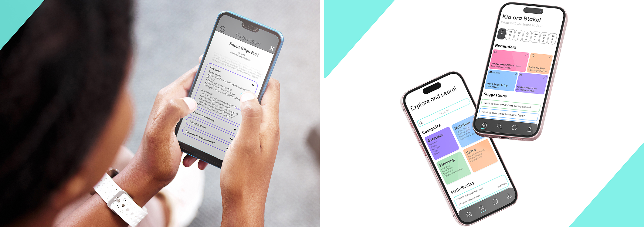
Coachlas introduction
Coachlas is your supportive fitness companion that not only guides your workouts, but helps you understand them. From myth-busting to clear, in-depth insights on exercise and nutrition, Coachlas brings smart, simple fitness education to every step of your journey.
Project Overview
Problem Statement
Young adults often rely on social media for fitness advice, but the information is overwhelming, inconsistent, and often not tailored to their needs. There’s a clear gap between guidance and understanding.
UXUI process
Research Insights
- Social media fitness culture relies heavily on edited imagery.
- Creators use viral, aesthetic-driven trends to maximize engagement.
- Further 2% of fitness content on social media in the US were also backed up scientific research.
Survey
- 4 digitally influenced university students with fitness experience
- 75% have been personally misled by fitness or nutrition content.
- Participants were frustrated by algorithms favouring hype over facts.
- Strong demand for fitness content that is transparent and backed by scientific research.
Brainstorming
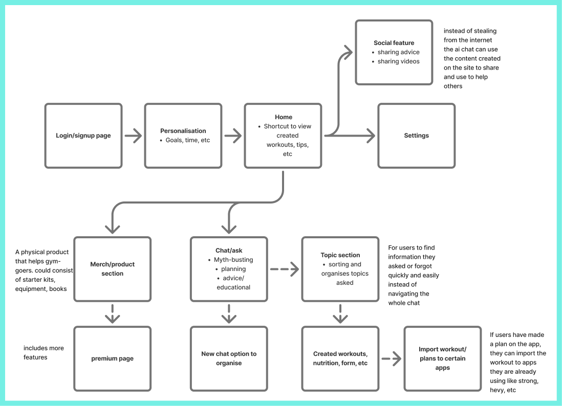
Further ideation was done, such as looking into fitness coaching space online, moodboard/style-scapes which lead me to creating a sitemap.
Competitors apps I’ve looked into are more for setting up plans/guidance and tracking instead of on the educational side for young adults.
Lo-fi prototype
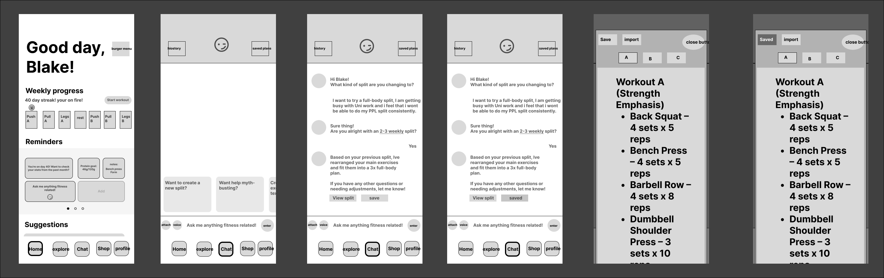
To evaluate the efficacy of Coachlas, usability testing was conducted.
- Target Audience: Active university students aged 19–24 who watches fitness related content
- focusing on a specific user flow: transitioning a high-frequency workout schedule to a more manageable three-day plan.
Feedback highlighted a clear distinction between functional ease and content depth as well as adjustments to the layout.
“I think colour would make it easier to tell what’s important. Right now, it feels a bit cluttered and claustrophobic; there’s a lot of text and a lot of boxes, so everything kind of competes for attention.”
Hi-fi prototype
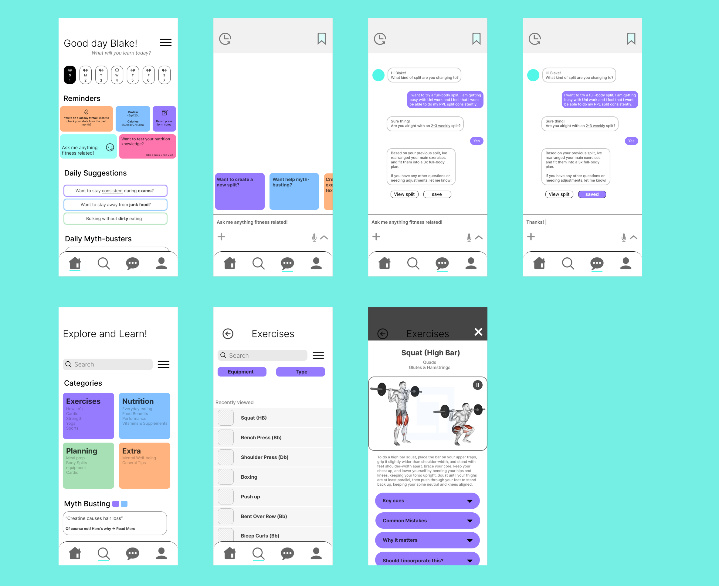
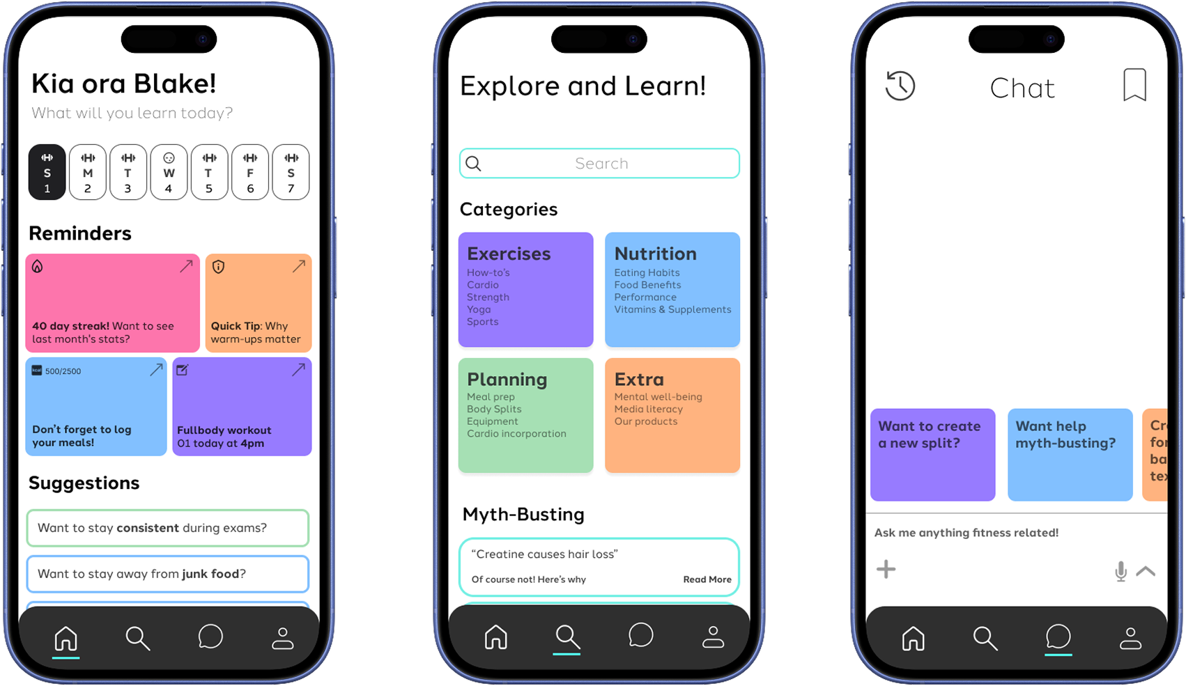
I further developed navigational Hi-Fi prototype based on feedback.
Feedback insights for Hi-Fi
- Aligning icons and imagery with the proportions of the prototype
- Using more consistent icons
- Adjustments to the hierarchy of information in the home screen
Interactive prototype
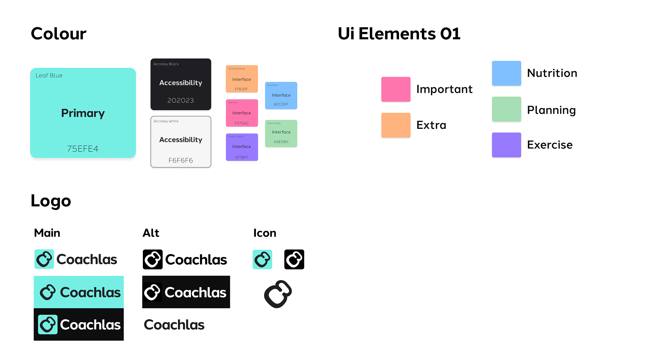
Branding
Reflection
This project helped me develop a stronger understanding of user-centred design, research-driven problem solving, and how to create a digital product that effectively addresses real user needs.
During my final presentation I have received feedback regarding feature prioritisation and user alignment. Moving forward, the strategic refinements for Coachlas include:
- Sharpening the Core Value: The initial design included tracking and coaching features that bloated the UX and diluted the app’s purpose. In future iterations, evidence-based education will be the singular core value, carving out a distinct niche in a saturated market and directly solving the problem of fitness misinformation.
- Simplifying for the Target User: A feature-heavy interface creates an overwhelming learning curve for beginner-to-intermediate lifters. Streamlining the product ensures the UX matches the user’s experience level.
Future Application: This project highlights the importance of maintaining a strict scope. Moving forward, I will ensure feature sets remain strictly anchored to the primary problem statement and user onboarding needs.