Sprout case study
Project Overview
Problem Statement
Te Ara Tukutuku currently lacks a strong digital presence to effectively communicate its historical, cultural, and environmental significance. The absence of interactive tools and social media engagement limits public access to information and weakens opportunities for meaningful community involvement.
Our solution
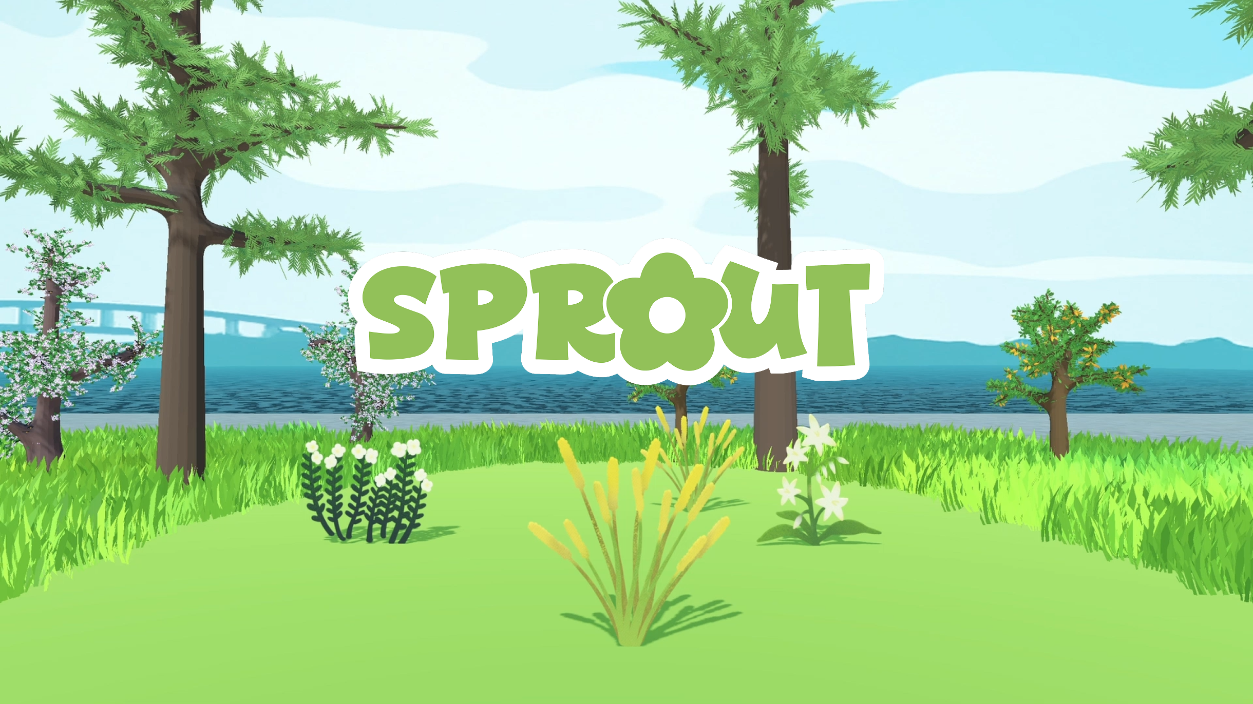
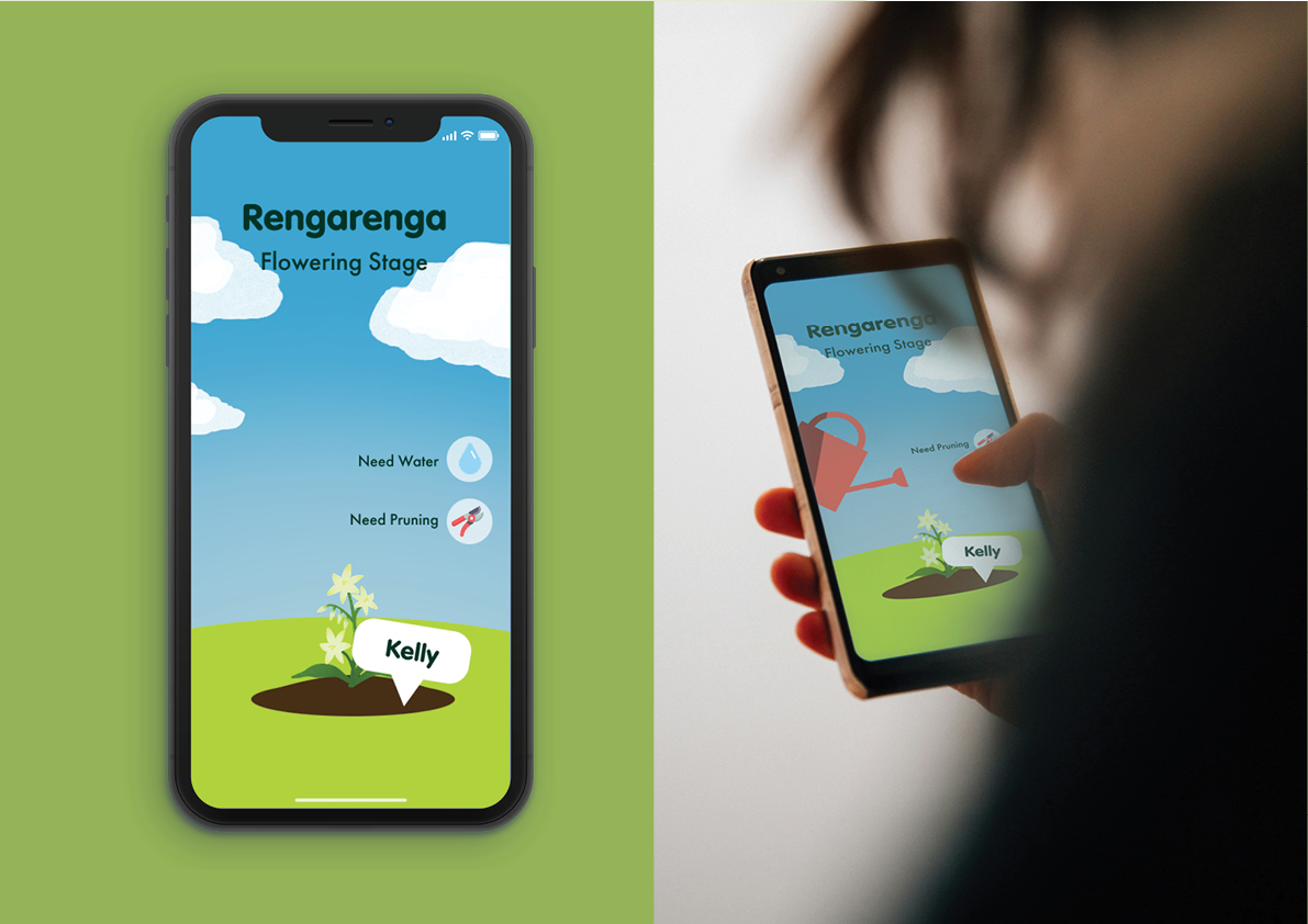
An interactive digital ecosystem where users nurture, and grow alongside their virtual plants through a quiz. Over time, the collective participation gives life to the virtual biome, reflecting the regeneration of Te Ara Tukutuku.
For this project, I focused on conducting the background research, developing & testing the main website for Sprout, bringing the platform to life using original artwork from the team.
Mockups
UX/UI process of Sprout
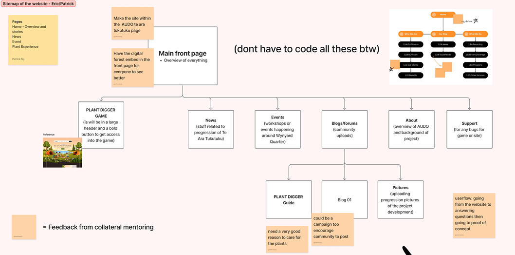
This was the initial website sitemap layout originally planned before creating the initial wireframe prototype. To create a seamless and accessible experience, the idea was planned to be part of the AUDO’s official website.
Lo-fi prototype
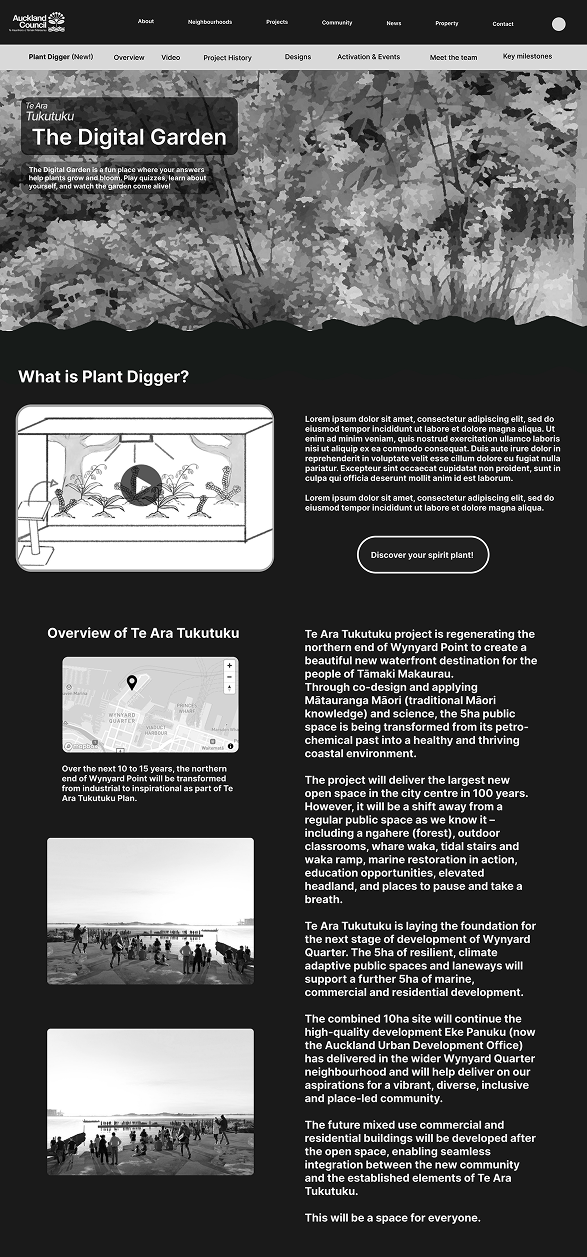
To validate our structure, we built a low-fidelity black-and-white prototype (originally titled The Digital Garden) and ran multiple user testing sessions to gather feedback.
Core Insights
- Users rated the navigation flow a 4/5 to 5/5, confirming the core structure and quiz are fast and intuitive.
- The core value proposition strongly resonates with a younger target audience.
- Lacked a aesthetic required to keep young users engaged.
- Minor inconsistencies in button naming and a slow introduction sequence caused brief layout confusion.
Next Steps & Action Plan
- Standardise button naming and sharpen visual hierarchy to completely eliminate layout confusion.
- Introduce bright colours, playful illustrations, and an immersive forest theme to maximize child-friendly appeal.
Refined lo-fi and hi-fi development
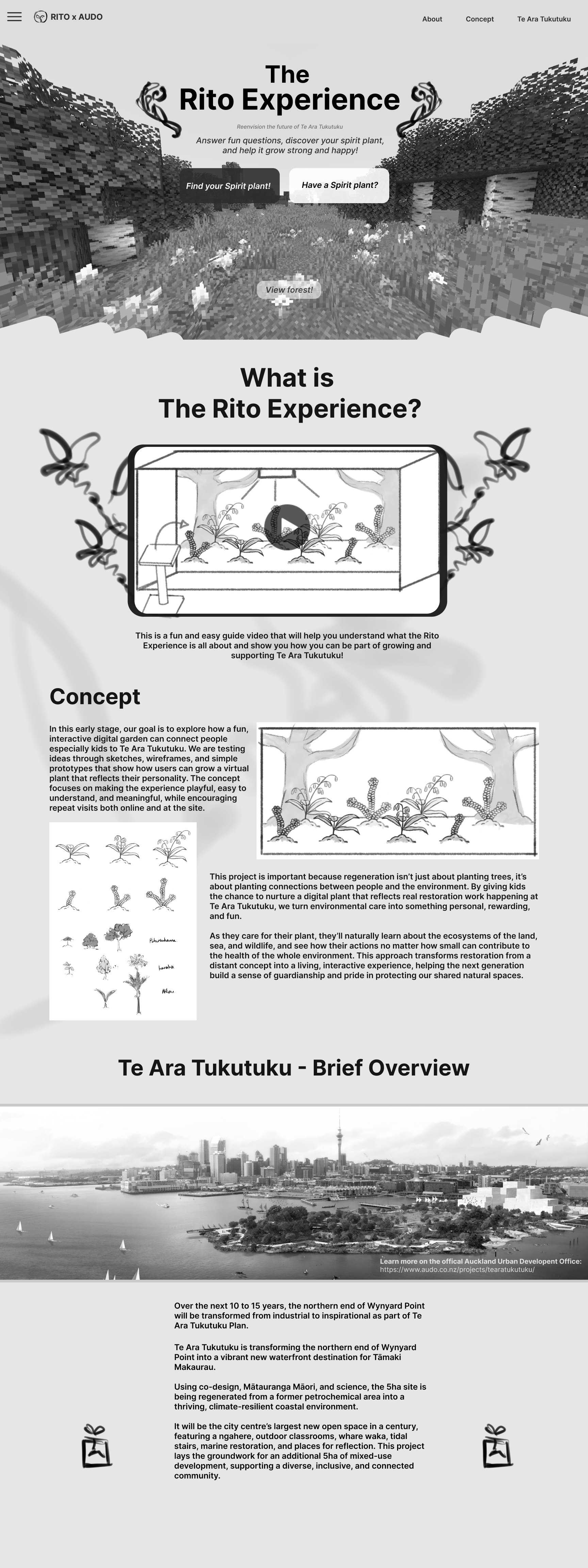
Post-Testing Refinements - Lo-fi prototype
Renamed the project to ‘Rito Experience’ and launched it as a standalone website to prevent cluttering the main AUDO platform.
Added imagery and layout adjustments to create an approachable, friendly vibe tailored for parents and children.
Feedback & decisions
Further layout adjustments would be the focus to ensure a more seamless, user-centric experience while the quiz will be made separately.
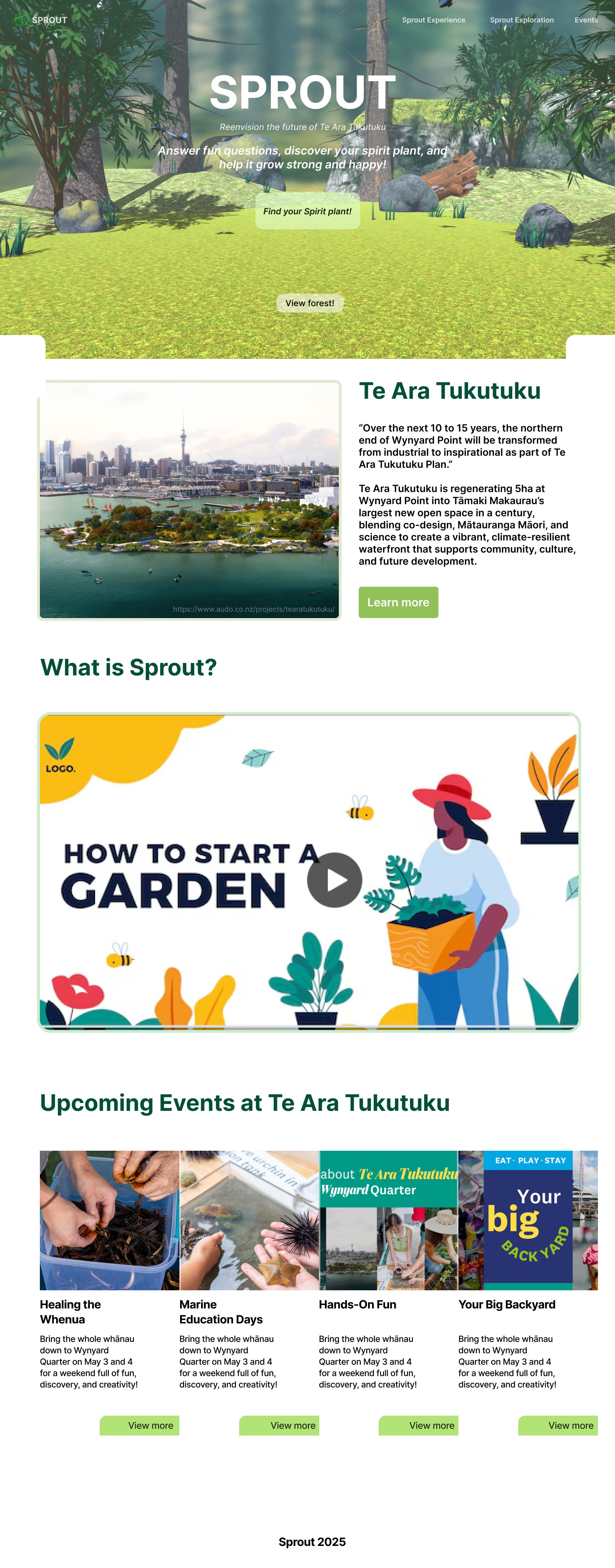
Hi-fi prototype development
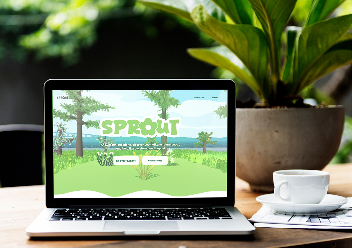
Changed project name to Sprout to fit our tone of voice and added the digital forest made by the team.
Made layout into a simple scrolling experience with a cleaner narrative structure: Overview → Explainer Video → Events.
Trimmed and condensed heavy text blocks into short, bite-sized information chunks for fast reading.
Established the core design framework, paving the way to integrate team artworks and a Te Ara Tukutuku map section in the next sprint.
Final website
Finally, this is the completed website of Sprout. More imagery and branding was added and a stylised digital forest was also added to fit with our aesthetics.
In this website, the addition of the map overview was also created as well as shortening and adjustments to the layout for much better user experince.
Team Info
-
Team Leader/Motion
Saige Moss
- Illustration/drawing/animation
- Concept Development
- Photography
- Branding/ Design
-
Producer/Interactive
Eric Hwang
- Research/user testing
- Coding/Hi-fi development
- Ui design
-
Scribe/Graphic
Holly Wang
- Research
- Digital painting
- Moodboards
-
Scribe/Motion
Tumai
- Storyboard artist/ scripts.
- 2D motion design
-
Producer/Interactive
Patrick Ng
- Coding HTML, JavaScript
- User Journey
- Illustration
Reflection
Working within a multidisciplinary team of five on Sprout was an invaluable experience in collaborative design and agile communication. Beyond teamwork, the project reinforced the importance of in UX; accepting constructive criticism from both industry lecturers and user testing allowed us to strip away personal biases and iterate purely for the user’s benefit.